Designing This Site: From Figma to Webflow
This site is its own case study. I designed it in Figma as a responsive system, then brought it into Webflow with the help of AI and built a CMS template so every project page, including this one, shares one structure. It's how I've approached restaurant brands for nearly a decade, applied to my own work.

What was the project about?
Designing and building my portfolio end to end: art direction, a responsive design system in Figma, and a Webflow build with a CMS behind every case study. I owned every decision, from the type scale to the field names an editor sees when adding a new project.
What needed to be improved or created?
After nine years designing inside a proprietary CMS, my best work lived on other people's platforms. I needed a home for it that I could build, update, and grow on my own, and that showed how I work in Figma, not just the finished result.
What design choices mattered most?
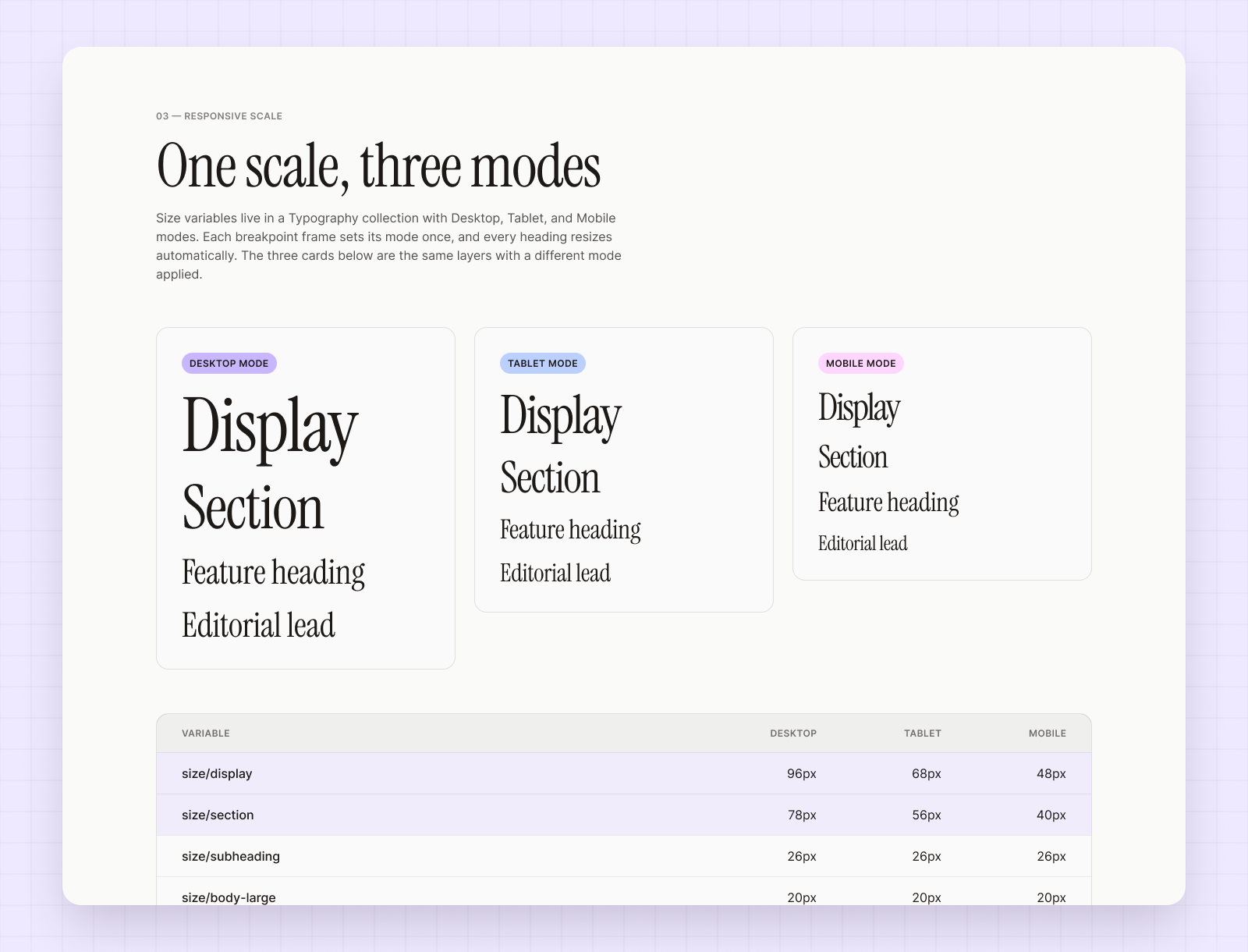
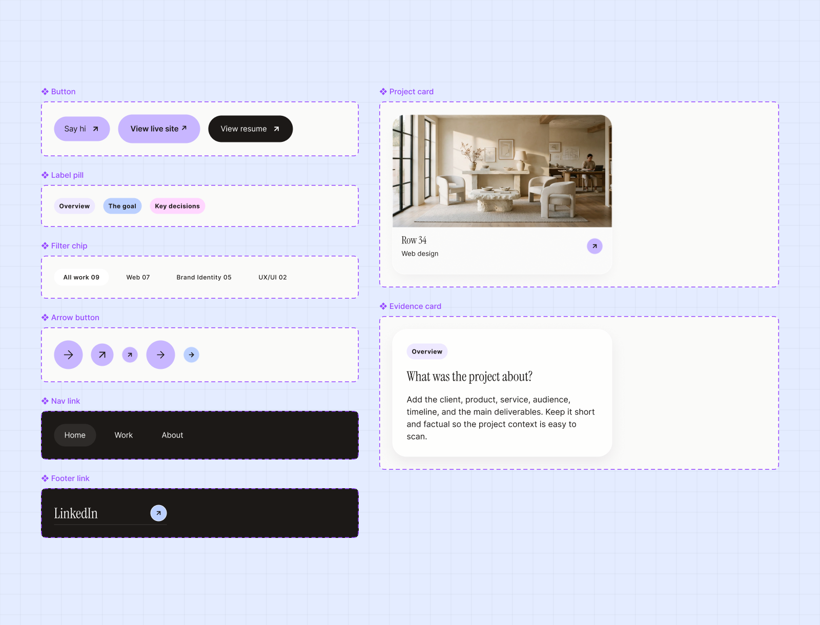
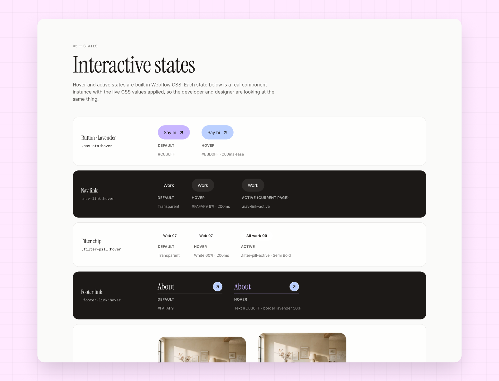
Design it as a system first. Color and type live as Figma variables that map to Webflow variables, repeated elements are components, and every case study runs on one CMS template. Adding a project means filling in fields, not redesigning a page.
Additional project highlights
Inside the Figma file: the system behind every page on this site.
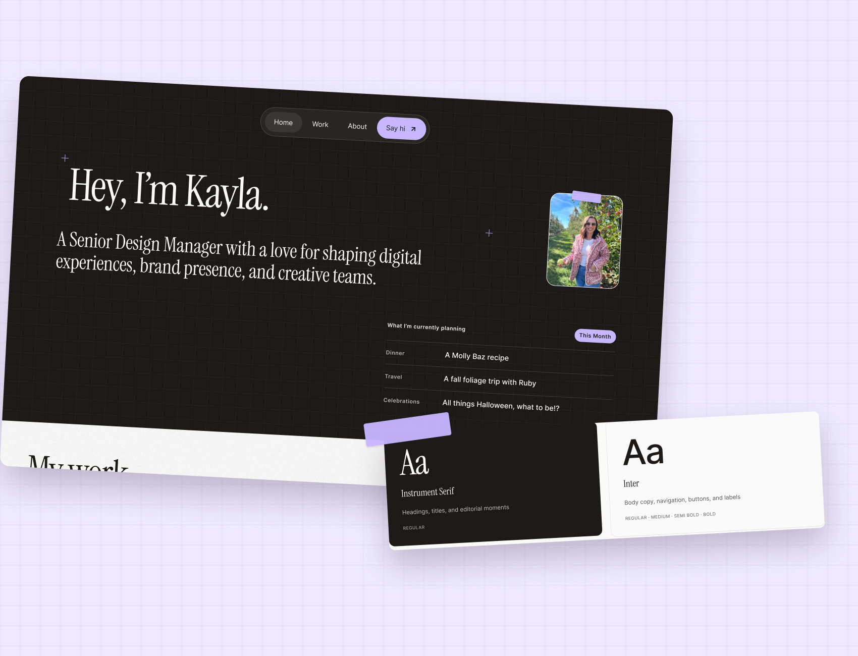
Drafted on graph paper
I wanted the site to feel like a designer's working page. A dark drafting grid sits behind each hero, registration marks bracket the titles like a print proof, and an editorial serif pairs with a clean sans for everything you read or click. Three soft pastels handle labels and interaction, so the restaurant photography in each case study stays the star, while tilted photo cards and a strip of lavender tape keep it personal.